Understanding Information Transfer
Uploaded by
BONALA KONDAL- What is Information Transfer?
- Importance of Information Transfer
- Graphics
- Advantages
- Types of Graphic Representations
- Conclusion
Common questions
Powered by AIPie charts effectively represent data by dividing a circle into sectors that visually depict the sizes of data components relative to the whole . Unlike other charts, pie charts uniquely display the proportion of each part in relation to the entire dataset, providing immediate visual insight into percentage-based distributions .
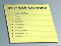
Different graphic representations aid data interpretation by providing tailored visual formats: maps show geographical outlines; tables organize datasets for clear comparison; line graphs illustrate relationships between two variables; bar charts display qualitative variable levels; flow charts represent sequential processes; pie charts show parts of a whole; tree diagrams depict organizational or genealogical structures; and pictograms use imagery for presentation .
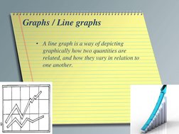
Line graphs effectively showcase r...provided like in showing trends, they can become cluttered with multiple lines, potentially leading to confusion .
Maps and plans are significant in information transfer as they depict spatial relationships and structures on a plane surface, useful for showing geographical or structural contexts clearly . They differ from other graphic representations by focusing on spatial data, outlining boundaries, and showing physical features like roads or rivers, unlike charts or diagrams which primarily present abstract data or organizational relationships .
Flow charts are used to depict industrial processes by illustrating each step of a production or procedural sequence with standardized shapes. They are effective because they provide a clear, organized view of each stage, allowing for quick comprehension of complex sequences and facilitating process optimization . The convention of using specific shapes (squares, rectangles, diamonds) enhances clarity and consistency .
Bar charts are used to represent the levels of qualitative, independent variables with individual bars, each labeled with value indicators . They are particularly useful for comparing discrete categories and displaying frequency distribution, enabling easy visual comparison of different data groups .
Pictograms offer the advantage of using images and symbols to represent data, making them highly engaging and easy to understand at a glance . However, potential limitations include the oversimplification of complex data, the potential for misinterpretation if symbols are unclear, and the difficulty in representing detailed quantitative data .
Effectively using graphics in presentations can greatly enhance audience understanding and engagement by providing visual context and making complex information more digestible . Graphics serve as alternative modes of presenting information, complementing verbal explanations, facilitating quick information retrieval, and making data comprehensible at a glance. Visual aids can attract and maintain audience attention, conveying messages more powerfully and memorably than text alone .
Information transfer enhances understanding by converting verbal information into graphic or pictorial forms, making complex data more accessible. It is crucial in narration, describing physical processes, listing, classifying, comparing and contrasting, showing cause and effect, and generalizing numerical data . The key advantages include quick data retrieval, efficient summarization, and easier comparisons involving extensive datasets .
Tree diagrams play a role in representing hierarchical structures by visually mapping out the relationships and responsibilities within organizations or large groups . They differ from pie charts, which depict parts relative to a whole rather than hierarchical relationships, focusing on illustrating proportions rather than connections or organizational lines .