View
Apigee Edge documentation.

A theme consists of a global style sheet that provides a uniform look and feel for all of the pages in your portal. The goal of a theme is to let you change the look and feel across all of your portal pages at one time.
You can customize, preview, and publish your theme, as described in the following sections.
Customize, preview, and publish the theme for your portal in the theme editor.
To access the theme editor:
Open the Portals page.
In the Apigee in Cloud console, go to the Distribution > Portals page.
Go to Portals
Click the row of the portal for which you want to edit the theme.
Open the editor.
The theme editor lets you:
A majority of the base theme style rules defining the site's appearance are based on angular material design. Angular material design uses grid-based layouts and consistent components and styling to provide a unified interactive experience.
The style rules are defined using Sassy Cascading Style Sheet (SCSS). SCSS is a superset of Cascading Style Sheets (CSS), offering the following advantages:
For example:
// Variable declaration
$my-variable: 12px;

// Nested selectors
.container-selector {
  .element-selector {
    padding: $my-variable;
  }
}

// The SCSS compiler will compile the above code to:
.container-selector .element-selector {
  padding: 12px;
}

// Function declaration
@function double($x) { return $x * 2; }

// Call function
.my-selector { height: double(12px); }

// The SCSS compiler will compile the above code to:
.my-selector { height: 24px; }
SCSS is compiled and converted to plain old CSS before the content is rendered on the web page.
An angular material stylesheet,
material theming SCSS file (material-theming.scss), is used by the base theme. This stylesheet declares variables, functions, and mixins that can be overridden using custom variables and SCSS sections, as described in Customizing the theme using the advanced theme editor.
Based on your UI theme selections, a number of SCSS variables are declared that define typography, color, and layout styles and are consumed by the base stylesheet. You can override the variables listed in the theme variable reference.
Customize the color palette using the basic styles editor or by overriding theme variables.
The color palette definitions for the integrated portal are grouped into the following categories, which are defined using material design color styling in the base theme.
| Category | Styles |
| Primary | Navigation toolbars, headings, card headers, and buttons |
| Secondary | <pre> and <code> text
|
| Accent | Navigation, links, and accented buttons |
| Warn | Warnings and errors |
Quickly customize the primary and accent color palettes using the basic styles editor.
To customize the color palette using the basic styles editor:
Specify primary and accent colors.
Click Publish to publish your theme. You will be prompted to confirm the update.
To customize the color palette by overriding theme variables, access the advanced theme editor and include one or more of the following variables with adjusted values in the Variables section to change the primary, secondary, accent, or warning message colors, respectively. See About the color palette categories.
$primary: mat-palette($mat-grey, 800, 100, 900);
$secondary: mat-palette($mat-green, 700, 100, 900);
$accent: mat-palette($mat-blue, 600, 700, 900);
$warn: mat-palette($mat-red);
View the contents of the imported material theming SCSS file (material-theming.scss) to identify the predefined color variables (such as $mat-grey). The numerical values indicate the shading values for the default, lighter, and darker elements, respectively.
Alternatively, you can create your own color variable. For example:
$my-color-variable: (
    50 : #f9f0e7,
    100 : #f0d8c2,
    200 : #e6bf9a,
    300 : #dba572,
    400 : #d49153,
    500 : #cc7e35,
    600 : #c77630,
    700 : #c06b28,
    800 : #b96122,
    900 : #ad4e16,
    A100 : #ffebe0,
    A200 : #ffc9ad,
    A400 : #ffa77a,
    A700 : #ff9661,
    // Color to render text presented on a background of the same level
    contrast: (
        50 : #000000,
        100 : #000000,
        200 : #000000,
        300 : #000000,
        400 : #000000,
        500 : #000000,
        600 : #000000,
        700 : #ffffff,
        800 : #ffffff,
        900 : #ffffff,
        A100 : #000000,
        A200 : #000000,
        A400 : #000000,
        A700 : #000000,
    )
);
Then, use it to change the color palette, as shown in the following example:
$primary: mat-palette($my-color-variable, 900, 200, 400);
Customize the font family and styles using the basic styles editor or by overriding theme variables. You can also import a custom font.
To customize the font family and styles using the basic styles editor:
To customize the font family and styles by overriding theme variables, access the advanced theme editor and include one or more of the font family and style variables with adjusted values in the Variables section.
For example, to change the default font to Arial, define the following variable:
$typography-main-font-family: 'Arial';
Import a Google font (not included in the set of default fonts) or your own custom font, then reference the custom font in your style sheet, as described below.
To import a Google font, access the advanced theme editor and import the font in the Custom Styles section, as shown below:
@import url(https://fonts.googleapis.com/css?family=Indie+Flower);
Import your own custom font using the @font-face CSS rule. The @font-face rule supports a number of different file format types, including TrueType (TTF), Web Open Font Format (WOFF), and more.
To import your own custom font:
Access the advanced theme editor and add the @font-face rule to the Custom Styles section, where font-family specifies the font name, url specifies the location of the font file (in this case, the assets manager), MyCustomFont.tff is the name of your custom font file, and format specifies the font format.
@font-face {
   font-family: 'MyCustomFont';
   src: url('files/MyCustomFont.tff') format('truetype')
}
Reference the custom font in one of the font family and style variables in the Variables section. For example:
$typography-main: mat-typography-config(
    $font-family: '"Indie Flower", "Oxygen", sans-serif',
    $display-4: mat-typography-level(112px, 112px, 300), // One-off huge headers
    $display-3: mat-typography-level(56px, 56px, 400), // One-off large headers
    $display-2: mat-typography-level(45px, 48px, 400), // One-off medium headers
    $display-1: mat-typography-level(34px, 40px, 400), // One-off small headers
    $headline: mat-typography-level(24px, 32px, 400), // <h1> tags
    $title: mat-typography-level(20px, 32px, 500), // <h2> tags
    $subheading-2: mat-typography-level(16px, 28px, 400), // <h3> tags
    $subheading-1: mat-typography-level(15px, 24px, 400), // <h4> tags
    $body-2: mat-typography-level(14px, 24px, 500), // Bolder body text
    $body-1: mat-typography-level(16px, 22px, 400), // Base body text
    $caption: mat-typography-level(12px, 20px, 400), // Smaller body and hint text
    $button: mat-typography-level(14px, 14px, 500), // Buttons
    $input: mat-typography-level(16px, 1.125, 400) // Input form fields
);
You can customize the logos used in the portal at the following locations:
| Logo location | Default file size |
|---|---|
| Desktop navigation toolbar | 196 x 32 pixels |
| Mobile navigation toolbar | 156 x 32 pixels |
| Favicon in browser address bar (and other locations) | 32 x 32 pixels |
| Sign In page | 392 x 64 pixels |
Customize the logo in the navigation toolbar for desktop and mobile displays. Depending on the width of your browser, you may see the desktop or mobile version of the logo.
You cannot delete the primary logo, you can only replace it. If you do not specify a logo for the mobile display, the primary logo is used by default.
To customize the logo used in the navigation toolbar for desktop and mobile displays:
Upload the primary logo.
Upload the mobile logo.
Click Save.
Click Preview to preview the portal changes in a browser. Depending on the width of your browser, you may see the desktop or mobile version of the logo.
Click Publish to publish the changes to your portal. Confirm the operation when prompted.
To customize the favicon used in the web browser address bar (and other locations:
Locate the favicon file.
Click Open to upload the file.
Click Save to preview your changes in the left pane.
Click Publish to publish the changes to your portal. Confirm the operation when prompted.
Customize the logo on the Sign In page when configuring the registration and sign-in experience for your developer program, as described in Manage company information.
The following provide some quick tips for customizing the navigation toolbar:
$layout-header-height: 64px;$layout-footer-height: 44px;Customize the background image on the home page by performing any of the following tasks:
Upload your own version of the home-background.jpg image to the assets manager using the same name and relative file size (3000 pixels x 1996 pixels). For more information, see Manage your assets.
Modify the background image filename and its padding by accessing the advanced theme editor and including the following SCSS with adjusted values in the Custom Styles section:
#index {
  &.main {
    .main-content {
      padding: 0;
      background-image: url('/files/home-background.jpg');
      background-size: cover;
    }
  }
}
Add a background image to all pages in the portal by accessing the advanced theme editor and including the following SCSS with the adjusted value in the Custom Styles section:
 body {
    background-image: url('/files/background-image.jpg');
 }
Customize the typography by accessing the accessing the advanced theme editor and adjusting the values for one or more of the following typography variables in the Variables section:
$typography-main$typography-header$typography-footer$typography-context-barFor example:
// Main content typography (includes dialog and notification popups)
$typography-main: mat-typography-config(
    $font-family: 'Roboto, "Oxygen", sans-serif',
    $display-4: mat-typography-level(112px, 112px, 300), // One-off huge headers
    $display-3: mat-typography-level(56px, 56px, 400), // One-off large headers
    $display-2: mat-typography-level(45px, 48px, 400), // One-off medium headers
    $display-1: mat-typography-level(34px, 40px, 400), // One-off small headers
    $headline: mat-typography-level(24px, 32px, 400), // <h1> tags
    $title: mat-typography-level(20px, 32px, 500), // <h2> tags
    $subheading-2: mat-typography-level(16px, 28px, 400), // <h3> tags
    $subheading-1: mat-typography-level(15px, 24px, 400), // <h4> tags
    $body-2: mat-typography-level(14px, 24px, 500), // Bolder body text
    $body-1: mat-typography-level(16px, 22px, 400), // Base body text
    $caption: mat-typography-level(12px, 20px, 400), // Smaller body and hint text
    $button: mat-typography-level(14px, 14px, 500), // Buttons
    $input: mat-typography-level(16px, 1.125, 400) // Input form fields
);
Then, you can apply the typography to a specific CSS selector, as shown in the following example:
@include mat-base-typography($custom-typography-config, '.css-selector');
Alternatively, you can apply a specific typography level defined in the custom typography to a CSS selector, as shown in the following example:
.css-selector {
  @include mat-typography-level-to-styles($custom-typography-config, display-3);
}
Customize the theme by overriding theme variables or by customizing theme style elements directly in the advanced theme editor.
Override theme variables in the Variables section of the advanced theme editor. For a list of theme variables, see Theme variable reference.
For example, to customize the height of the header and footer navigation toolbars, include the following variables, respectively, with adjusted values in the Variables section of the advanced theme editor:
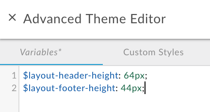
For additional examples, see:
To override theme variables:
Customize the theme style elements directly in the Custom Styles section of the advanced theme editor.
For example, to change the color of the Create button on the New App page that appears when registering apps in the portal, include the following theme style element with an adjusted value:
.main .main-content button.app-save {
  color: blue;
}
See also Customize the background image.
To customize the theme style elements:
To create a full-width panel in a portal page:
.full-width__container { position: relative; left: 50%; right: 50%; max-width: 100vw; margin-left: -50vw; margin-right: -50vw; background-image: url("/files/your-image.jpg"); background-size: cover; background-position: 50% 50%; padding: 0; }.full-width__centered { @include centered-content(); } .full-width__content { // Add any additional padding here and NOT in .full-width__centered. Adding padding to // .full-width__centered will result in a horizontal scroll bar. You can exclude this class // and corresponding <div> container if no additional padding control other than the // min page padding is needed. }
<div> element, as described in Develop portal content using the page editor:
<div class="full-width__container">
  <div class="full-width__centered">
    <div class="full-width__content">  <!-- Include this div if you need additional padding -->
      <h2>Full Width Container</h2>
      <p>
        This content will align with the page header and other content outside
        of this full width container
      </p>
    </div>
  </div>
</div>To publish to the live portal the theme and style customizations that you have added:
To view your published content in the live portal, click View Portal in the top navigation toolbar.
CSS specificity describes the method used by a browser to determine precedence for CSS style element declarations when conflicts arise. CSS specificity is calculated by applying a weight to a specific CSS style element declaration based on its selector type. The more specific the CSS selector, the higher the weight. An ID attribute, for example, will be given a higher weight in the calculation than a type selector.
For example, if you define the following style elements in your CSS code, the paragraph element will be colored red because the p style element declaration within a div element is more specific than the p style element declaration.
div p { color: red }  ← More specific
p { color: blue }
Similarly, if you define the following style element declarations in your CSS code, then any text enclosed in <div class="test"></div> tags will be colored blue because the id attribute style declaration within a div element is more specific than the div style element declaration.
div#test { background-color: blue; }  ← More specific
div { background-color: red; }
For style element declarations with the same specificity, the last style element declaration defined will take precedence. For example, given the order of the following style element declarations, the paragraph element will be colored blue.
p { color: red }
p { color: blue }  ← Last specified
The following sections summarize the variables that can be overridden in the Variables section of the advanced theme editor, as described in Override theme variables.
Customize the foreground colors of the base theme used throughout the site. Valid values are light and dark.
$base-theme: light;
Customize the color palette by modifying the following variables to change the primary, secondary, accent, and warning message colors, respectively. See About the color palette categories.
$primary: mat-palette($mat-grey, 800, 100, 900);
$secondary: mat-palette($mat-green);
$accent: mat-palette($mat-blue);
$warn: mat-palette($mat-red);
The numerical values indicate the shading values for the default, lighter, and darker elements, respectively. View the contents of the material theming SCSS file (material-theming.scss) to identify the predefined color variables.
For example, you can change the primary color palette to green, as follows:
$primary: mat-palette($mat-green, 800, 100, 900);
To customize only the shading values for the default color set defined in the base theme, include the following code with adjusted shading values:
$primary: mat-palette($custom-hex-primary, 800, 100, 900);
$secondary: mat-palette($custom-hex-secondary, 800, 100, 900);
$accent: mat-palette($custom-hex-accent, 800, 100, 900);
$warn: mat-palette($custom-hex-warn, 800, 100, 900);
Customize the font family and styles.
// If using a custom font, import it by URL.
$typography-main-font-family: 'Roboto, sans-serif';

// Must resolve to a pixel value
$layout-responsive-breakpoint: 900px;
$layout-header-height: 64px;
$layout-header-menu-item-height: 36px;
$layout-header-menu-item-horiz-padding: 16px;
$layout-header-nested-menu-item-vert-padding: 5px;
$layout-header-menu-resp-item-height: 64px;
$layout-footer-height: 44px;
$layout-footer-menu-item-height: 36px;
$layout-footer-menu-item-horiz-padding: 16px;
$layout-footer-nested-menu-item-vert-padding: 5px;
$layout-context-bar-height: 60px;
$layout-context-bar-button-height: 36px;
$layout-context-bar-button-horiz-padding: 16px;
$layout-main-content-max-width: 1400px;
$layout-main-content-vert-padding: 38px;
$layout-horizontal-min-padding: 24px;

// Uses variables declared above
$typography-header: $typography-main;
$typography-footer: $typography-main;
$typography-context-bar: $typography-main;
Specify your own custom typography for more fine-grained control, as shown in the following example:
$typography-context-bar: mat-typography-config(
    $font-family: 'Ubuntu, sans-serif',
    $headline: mat-typography-level(30px, 30px, 500), // Title
    $button: mat-typography-level(19px, 19px, 200) // Action buttons
);
Customize the angular material typography. Each typography level defines a font size, line height, and font weight.
$typography-main-display-4: mat-typography-level(112px, 112px, 300);
$typography-main-display-3: mat-typography-level(56px, 56px, 400);
$typography-main-display-2: mat-typography-level(45px, 48px, 400);
$typography-main-display-1: mat-typography-level(34px, 40px, 400);
$typography-main-headline: mat-typography-level(24px, 32px, 400);
$typography-main-title: mat-typography-level(20px, 32px, 400);
$typography-main-subheading-2: mat-typography-level(16px, 28px, 400);
$typography-main-subheading-1: mat-typography-level(15px, 24px, 400);
$typography-main-body-2: mat-typography-level(14px, 24px, 400);
$typography-main-body-1: mat-typography-level(16px, 22px, 400);
$typography-main-caption: mat-typography-level(12px, 20px, 400);
$typography-main-button: mat-typography-level(14px, 14px, 700);
$typography-main-input: mat-typography-level(16px, 1.125, 400);

// Copies properties declared above into a cohesive object
$typography-main: mat-typography-config(
  $font-family: $typography-main-font-family,
  $display-4: $typography-main-display-4,
  $display-3: $typography-main-display-3,
  $display-2: $typography-main-display-2,
  $display-1: $typography-main-display-1,
  $headline: $typography-main-headline,
  $title: $typography-main-title,
  $subheading-2: $typography-main-subheading-2,
  $subheading-1: $typography-main-subheading-1,
  $body-2: $typography-main-body-2,
  $body-1: $typography-main-body-1,
  $caption: $typography-main-caption,
  $button: $typography-main-button,
  $input: $typography-main-input);
Except as otherwise noted, the content of this page is licensed under the Creative Commons Attribution 4.0 License, and code samples are licensed under the Apache 2.0 License. For details, see the Google Developers Site Policies. Java is a registered trademark of Oracle and/or its affiliates.
Last updated 2026-07-23 UTC.

